Premium knife branding works when the knife looks planned, not noisy. A logo will not save a weak blade. The job is to make the same blade, handle, and grind read as cleaner, tighter, and worth the shelf price. In Yangjiang, China, we see it on the grinding line every week: a plain 58-60 HRC chef knife with a 0.35 mm edge can sit in the mid-market, or it can look retail-ready once the blade mark, box, and insert speak the same language.
Treating branding as late-stage decoration is the wrong question to ask. If your knife logo placement, premium packaging, and brand presentation are planned after tooling, the product looks mixed in-store and cheap when the buyer opens it. A 240-person factory in Yangjiang, Zhejiang, China can run 80,000+ pieces a month, but premium perception still comes down to small calls: a mark 3 mm too tall, a box wall that crushes at 600 g pressure, or an insert that lets the knife rattle during carton drop testing. We have seen this go sideways.
Branding Should Frame the Knife
Premium knife branding should frame the knife, not shout over it. If the steel spec and edge grind are weak, foil stamping on the sleeve will not rescue the SKU. We have seen this go sideways: QC pulled 20 pcs from a 1,000 pc trial order, and the buyer talked more about the uneven bevel than the nice black gift box. The math does not work. When the knife is already solid, branding lifts the price tier because the whole item feels planned before the first cut.
Start with one rule. The knife needs one clear position. Is it a cook’s work knife, a gift set, a cleaner home-kitchen piece, or a private-label line for retail shelves? Once that is fixed, the logo size, blade mark, insert card, and carton copy stop fighting each other. A 58-60 HRC chef knife with a brushed blade and tight handle fit can look expensive with a 12 mm logo and quiet typography on the box. The same knife looks cheap when the mark grows to 38 mm, the colors clash, and the PO says “satin finish” while the artwork file says “mirror polish.”
On the factory side, premium presentation comes from matching details. Keep the logo style, packaging finish, and paperwork language in the same lane. If you ship into Europe or North America, the outer message has to match the product promise and the compliance file, not just the mood board. Buyers notice thin cartons; they also flag 0.8 mm print-registration drift on a black sleeve because it shows up fast under warehouse lights. We run AQL 2.5 checks on presentation parts for a reason: the first impression is already half the sale, and for knives that is sourcing reality.
- Use one visual message, not three competing claims.
- Keep branding to 2-4 surfaces, such as blade mark, handle badge, insert card, and outer box.
- Make the box and knife feel like one product family, not two suppliers packed together.
Knife Logo Placement That Looks Intentional
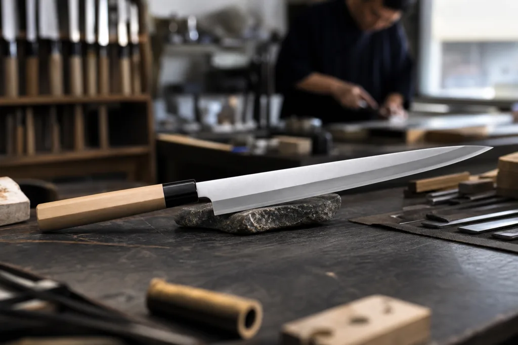
Knife logo placement is where most private-label programs go wrong. The logo comes in too large, sits too low, or lands on a curve where it looks like someone guessed. We see this on the first strike sample often; QC pulled one last month where the mark was 34 mm wide on an 8-inch chef knife, and the buyer flagged it before we even measured the blade. For that size, a primary blade mark around 18-28 mm wide is usually enough. Push it past 30 mm on a narrow European profile and the math doesn't work. The blade starts to look crowded.
For premium kitchenware brands, we place the main mark in the upper third of the blade, with 3-5 mm clearance from the spine and safe distance above the grind line. Keep it away from the cutting edge and the sharpening choil. Simple rule. Still, it gets missed when artwork is copied from a box layout instead of redrawn for the blade shape; we once received an AI file named “carton_logo_final_final.ai” and the mark sat half on the satin grind. On polished or satin stainless, laser marking from the fiber laser reads clean and technical. On Damascus, keep the mark quiet so it does not fight the pattern. On black-coated blades, contrast can work if the mark stays small, sharp, and under control.
Do not cover every surface just because the factory can run it. This is the wrong question to ask. One good blade mark, one accurate carton mark with the right barcode position, and one clean insert card is enough for most 500-3,000 pc export runs. Too many marks make the knife feel mass-produced, like a promo item from the grinding line. If the handle uses premium wood or G10, a small secondary mark on the handle scale or bolster can work, but only when it adds value instead of noise. In our Yangjiang export work, the cleanest brands choose restraint over repetition.
- Blade mark: best for identity and shelf recognition, especially on 8-inch chef knives where buyers see the blade first.
- Handle mark: best for subtle private label or gift positioning when the scale material can take a clean mark.
- Box mark: best for retail storytelling, barcode discipline, and avoiding PO trouble at carton inspection.
Premium Packaging Carries Perceived Value
Premium packaging sells. We see it on the packing bench every week. If the lid flexes, the print looks muddy, or the board rings thin when QC taps it, the buyer assumes the knife is a step down too. A rigid box with a 1.5-2.0 mm greyboard shell, a fitted insert, and a clean outer shipper sends a different signal from a folding carton. For premium knife branding, that signal usually beats a fancier logo effect. This is the wrong question to ask: do you want a bigger logo, or a box that holds its shape?
The right build depends on channel. On a retail shelf, a rigid sleeve or magnetic-close box gives a cleaner first touch. For e-commerce, the inner retail box has to survive inside a durable mailer or master carton, because crushed corners kill the presentation faster than a chipped edge. We run molded pulp when the buyer wants a lower-plastic story, and we run EVA when the handle needs a tighter lock. Keep the insert quiet. If the knife rattles, the unboxing feels cheap. If the insert smells strong, Europe will flag it before the first review. QC pulled a sample last month and found 2 mm of play. The buyer pushed back on that one fast.
Make the box do work. Barcode space, SKU, and FNSKU need to be set before artwork lock. If you wait and add a sticker later, the math does not work and the carton looks patched. For Amazon and other channel partners, plan the label zone early. For Europe and North America, clean carton graphics, correct legal copy, and odor-free materials matter. Brand presentation is not just style; it keeps the carton moving through the warehouse, compliance desk, and receiving dock. We have seen a typo on a PO turn into a reprint on 5,000 boxes.
| Packaging format | Brand signal | Typical use | Extra unit cost |
|---|---|---|---|
| Folding carton | Basic to mid | Entry retail, volume packs | USD 0.20-0.60 |
| Rigid box | Premium | Gift, flagship retail | USD 0.80-2.50 |
| Rigid box with insert | Higher-end | Chef knives, gift sets | USD 1.20-3.50 |
Unboxing Needs A Clear Sequence
Unboxing is where the brand lands in the buyer’s head. They should understand the product in the first 10 seconds, not after 3 extra layers. If the opening feels like a puzzle, the premium effect is gone. For knife runs, we ship a clean sequence: outer shipper, printed retail box, tissue wrap, blade sleeve, reveal, then one useful insert. That is enough. On the packing bench, the tape gun and drop test tell you fast whether the pack is fighting the customer.
The opening path needs a job. Tissue wrap softens the reveal. A blade sleeve protects the edge and keeps fingerprints off the finish. A short card should cover steel, sharpening angle, care, and origin in plain language. If you add a QR code, use it for sharpening guidance, not brand poetry. QC pulled the sample on 6 phones and checked the scan in the pack room. Buyers in the United States and Europe ask for steel type, HRC band, care instructions, and warranty terms. The wrong question is how to sound fancy. The math does not work for vague copy.
Keep the physical feel tight. A knife that shifts inside the box signals poor control, even if the blade is fine. A little resistance when the tray opens feels premium; a rattle does not. For set programs, each item needs its own pocket or slot, and the hierarchy should be clear when the lid opens. At our Yangjiang workshop, we check tray clearance at 1.5 mm and reject anything that slides on the shake table. Three motions is enough. More than that, and the customer starts feeling packaging cost instead of product value. We have seen this go sideways fast.
- Reveal the logo on the first touch, not after 5 layers.
- Keep the first impression under 30 seconds.
- Use the insert to protect the product and back up the story.
Match Finish, Material, And Message
Branding works only when it follows the knife finish and material story. A brushed 10Cr15CoMoV chef knife should not speak like a mirror-polished 1.4116 line. Natural wood feels warm and kitchen-led; G10 or micarta feels more shop-floor, more utility. We had one buyer flag this on a pre-production sample: walnut handle, black tactical logo, gift-box font like a perfume brand. The math did not work. If the logo, box color, and typeface fight the steel or handle, the product feels patched together.
Surface choice matters on the grinding line. Satin and stonewashed finishes take laser marking well because the contrast stays readable at 0.18 mm line width without shouting. Mirror polish is less forgiving; a 28 mm logo on a 200 mm chef blade can look like a sticker even when the etch is clean. On coated or black blades, we run a small contrast logo and stop there. Do not fill the blade. With Damascus, the pattern sells the knife, so the mark should stay quiet. You want recognition, not a billboard.
Price point changes the whole presentation. A knife retailing at USD 35-50 needs a different box from a USD 90-150 piece. The upper tier can carry 1200 gsm board, soft-touch paper, magnetic closure, and a molded inner tray cut within 1 mm so the handle does not rattle in transit. Still, do not dress a workhorse like hotel jewelry. We have seen this go sideways when a buyer approved gold foil on a basic stamped line, then complained the sell-through felt weak. Premium kitchenware buyers spot that mismatch fast. If the knife is balanced, the mark should feel balanced. If the handle is angular and modern, keep the type clean.
- Satin blades: strong fit for laser marking or fine etch, with logo height around 6-9 mm on chef knives.
- Mirror blades: keep the mark small, crisp, and away from the main reflection line.
- Damascus blades: protect the pattern; use quiet marking near the heel instead of heavy ink.
Approve Artwork Before Mass Production
Most branding problems start at approval, not on the grinding line. The PDF looked clean, but QC pulled the sample and found the logo 4 mm too low, the box die-cut covering half the mark, or the barcode sitting across a fold line. Set the approval path before mass production starts. In a Yangjiang, Zhejiang, China program, changing logo art after sample approval can cost 3-7 days and leave scrap blades, cartons, and labels on the packing bench.
Use a tight workflow: artwork proof, physical sample, golden sample, pre-production sign-off, then mass production. Check the blade mark, box print, insert card, and barcode together; one changed file means the full set goes back under the loupe. For premium work, misaligned foil, off-center pad print, or dirty laser edges are major defects. Calling them cosmetic is the wrong question to ask. We usually recommend AQL 2.5 for carton print and packaging, and a tighter visual standard for blade branding when the knife is positioned as a premium retail item.
Here is a practical approval table that keeps sourcing teams honest. We run this against the signed PDF, the Pantone callout, and the actual carton flat from the print room.
| Stage | What you approve | Typical time | Common risk |
|---|---|---|---|
| Artwork proof | Logo size, colors, legal text, barcode | 1-2 days | Wrong file name, bad spelling, or a PO typo copied into print |
| Sample print | Mark position, contrast, box finish | 3-5 days | Logo prints too large, too faint, or 2 mm off center |
| Golden sample | Final reference for production | 2-3 days | Buyer flags late changes after sign-off |
| Mass production check | Random samples, carton flatness, rub test | 1-2 days | Print shift, dents, scuffs, or ink transfer after 20 rubs |
For custom-branded knife packaging, MOQs often start at 500-1,000 sets per SKU, with 35-50 days after artwork is locked. That is normal for a 240-employee factory in China running blade finishing and packaging assembly on the same schedule. We ship faster when the buyer approves early and keeps the design clean enough for repeatable pad print, laser marking, and carton assembly; we have seen complex foil layouts go sideways at the final rub test.
Frequently asked questions
For most premium chef knives, the best knife logo placement is in the upper third of the blade, usually 18-28 mm wide on an 8-inch profile. Keep it away from the edge and the choil, and leave enough space so the mark looks intentional instead of crowded. If the blade is satin or brushed, laser marking usually reads cleanly. If the finish is mirror-polished, keep the mark smaller because large graphics look harsh. One blade logo plus one box mark is usually enough for a premium feel. When you add too many marks, you make the knife look like a mass-market item instead of a branded tool.
It depends on the structure, print, and insert. A folding carton may add about USD 0.20-0.60 per set, while a rigid box with insert usually lands around USD 1.20-3.50. If you add magnetic closure, soft-touch lamination, foil, or a custom molded pulp tray, the cost rises again. For premium knife branding, that extra spend often makes sense because the box carries part of the perceived value. If your retail price is USD 60-120, the packaging needs to look like it belongs in that tier. For export orders in Yangjiang, China, we usually plan packaging cost early so the box does not eat the margin later.
Yes, but you need to be restrained. Damascus is already visually busy, so a large logo can fight the pattern and make the blade look cluttered. A small laser mark or a subtle etch in a clean area is usually the better choice. Avoid heavy ink fills that block the pattern, and do not place the mark where the pattern is most valuable visually. For premium presentation, let the Damascus do the visual work and keep the branding quiet. On higher-end lines, a narrow logo with a precise line weight often looks more expensive than a large graphic. Buyers in Europe and North America usually prefer that restraint.
Send editable vector artwork, usually AI or PDF, plus Pantone references, font outlines, barcode data, and any legal text for your market. If you need Amazon or retail labels, include FNSKU, EAN, or UPC details before the dieline is finalized. For premium knife branding, we also ask for the blade mark size, exact logo location, and a reference sample if you have one. That avoids the common mistake of designing the carton first and trying to squeeze the product identity into it later. If your brand sells in the EU or North America, give us the language requirements early so the packaging does not need a second print run.
Use a simple three-part check: alignment, durability, and visual consistency. The logo should sit where the approval sample shows it, with no visible tilt or blur. Rub-test the blade mark and carton print to make sure the artwork does not smear or flake under normal handling. Then check a small random lot against your golden sample using AQL 2.5 for packaging and a tighter visual standard for blade branding. If you are selling a premium item, off-center foil, crushed box corners, or a scratched logo should be treated as defects, not acceptable variation. That is how you protect brand presentation in real distribution.
Make the branding look expensive
Send your logo, target price, and box idea. We will match the mark method, packaging structure, and inspection standard to your knife program.
Request a Quote